
- #HGCREATORS
- #HGEXPLORE
- #HGVOICES
- #HGSHOP
- CAREERS
- ABOUT US
- CONTACT US
We all have our qualms about the increasing use of social media and all its downfalls. One thing, though, that it has been undeniably good for is serving as a platform for the exploration and recognition of incredible art from around the world. It has provided an outlet for creative minds to experiment and try out new styles while also engaging with their audience/viewers, giving rise to an interactive community of people. Over time, Instagram challenges have become exceptional showcases of innovation, talent and creativity. One that really piqued our interest is 36 Days of Type.
Putting it simply, the challenge is for artists and designers (or anyone interested, really) to create new typography and letters for the 26 alphabets and 10 numbers in unique and creative ways. Nothing is off limits and the kind of genius we’ve seen as a result has been incredible. Some have used this as a medium to present to the world their unique artistic sensibilities – from combining art, music and constellations, to 3D renders of everyday object – while others have just had fun with it.
While there are no picking favourites here – the amount of talent India is home to knows no bounds – we’ve put together some of our favourite creations by Indian artists and designers who we think really killed it this year with their ingenuity and originality.
‘Blessed be the Type’ was Narvankar’s Type challenge creation this year as he put together, as he stated, “A must-read glossary for every Handmaiden to survive in the Republic of Gilead.” Having taken up the theme of The Handmaid’s Tale, each of his works really is like a mini handbook for all the lovers of the Margaret Atwood’s book and subsequent TV show.
“A is for Aunts, a class of older women who are responsible for the training and discipline of the handmaids. They are true believers of the Gilead regime and employ the most brutal of methods in their indoctrination of your kind...”

“J is for Jezebel’s. Gilead ‘accepts’ that men ‘have needs’. This has led to the existence of Jezebel’s - a secret sex club unofficially sanctioned by the government for the entertainment of foreign diplomats and a few Commanders. The prostitutes include career women, sociologists or rebels who find working as a Jezebel preferable over the Colonies, especially as they are allowed access to forbidden items like books, make-up, alcohol, drugs and more.”

Guhathakurta’s series isn’t what we initially expected it to be, but that’s what makes it all the more special. Presenting his 36 Days of Type challenge through a series called ‘A Man...’, he uses each alphabet to illustrate everyday aspects of a man, any man, from the good to the bad, and also just hilarious.
C for Cries – “A man...cries because boys cry too.”

S for Strut – “A man struts his stuff, baby.”

You can follow him on Instagram to see more from the series.
III. Esha Agarwal
A phenomenal artist, Agarwal used this challenge to create a series of works that reflected the painters and sculptors that she admires. Through the process, she wrote, she also hoped to stumble upon new influences and creative works around the world to learn from. Each of her works are clearly inspired by key elements and tropes specific to the artists she celebrates through them.
E for Egon Schiele

F for Francisco Goya

Follow more of her work and the series on Instagram.
IV. Maanvi Kapur
Kapur celebrates women in her 36 Days of Type challenge, using watercolours. Women of all ages and ethnicities find a place in Kapur’s lovely portraits. Her collection is a diverse representation of the many faces of womanhood around the world.


One of the animators of Wade, an animated post apocalyptic film, of sorts, in the making about the animal-human conflict caused by climate change, saying Bhattacharyya is talented would be an understatement. This year, he took to illustrating his favourite movies from the world-over through the Type challenge.
E for Edward Scissorhands, directed by Tim Burton.
“The ultimate fitting-in movie. Particularly loved the satirical pastel uniformity of the neighbourhood and the ice sculpture scene.”

G for Goopi Gyne Bagha Byne, directed by Satyajit Ray.
“A breathtakingly magical story of two men at Rock bottom who take a stand against war using the power of music and food. This scene where they summon cauldrons of sweets from the sky never fails to amaze me.’

You can follow his work on Instagram.
VI. Rahul Khobragade
Using geometric design and vibrant colours, each of Khobragade’s creations almost look like a visual trick.
Letter E

Letter O

Find more from the series and his work on Instagram.
VII. Chaaya Prabhat
Through vivid colours and fantastical imagery Prabhat celebrated Type this year by depicting legendary mythical monsters and creatures. From a Hydra to Dragons and Yetis – all find a spot in Prabhat’s conceptualisation.
“W for Werewolf: a mythological human with the ability to shape-shift into a wolf, either purposely or after being placed under a curse (bite or scratch from another werewolf).”

“9 for Navagunjara: A legendary creature from Indian folklore composed of nine different animals - the head of a rooster, feet of an elephant, tiger and deer or horse; the fourth limb a raised human arm carrying a lotus, the neck of a peacock, the hump of a bull and the waist of a lion; the tail is a serpent.”

You can follow her work and see more from the series on her Instagram.
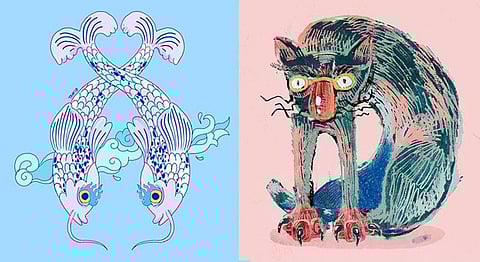
VIII. Taarini Ravjit
A tremendously talented artist all around, Ravjit’s series for this year was inspired by Thangka paintings, celebrating her stay and graduation project in Sikkim, as she explained. A Thangka is a Tibetan Buddhist painting that depict Buddhist deities and scenery, and are said to be aids for meditation.


See more of her series and work on Instagram.
IX. Mehr Chatterjee
A designer and animator, Chatterjee’s depictions of ‘mangy cat’s in typography are as delightful as they are slightly terrifying. The weirdly wonderful series goes to show the immense creativity and innovation that exist across our country and are proudly displayed during such challenges.
“A For Angry Cat!”

“E is for Egyptian cat (the ancient kind).”

You can follow her and view more of her work on Instagram.
X. Mannu Amrit
This series goes the creative route, an ode, of sorts, to Anurag Kashyap’s phenomenal film ‘Gangs of Wasseypur’ – a theme that Amrit writes is close to his heart. Depicting famous scenes and key dialogues, he pulls off this unique series amazingly.
G – “Ghoor kahe rahe ho?”

“Q goes out to Qureshi’s, a muslim sub caste of animal butchers that historically dominated the towns of Wasseypur and Dhanbad.”

View more from the series on his Instagram.
Feature image courtesy of (L) Taarini Ravjit and (R) Mehr Chatterjee.
If you enjoyed this article we suggest you read: