
- #HGCREATORS
- #HGEXPLORE
- #HGVOICES
- #HGSHOP
- CAREERS
- ABOUT US
- CONTACT US
[Note for Readers: This article is part 1 of a larger series in which we’re documenting the works of artists across three larger disciplines who have given, and continue to give, India’s independent music industry a sense of visual identity. These include the designers behind artworks–posters, album covers, logo identities and more–the creators orchestrating live visuals and concept design during gigs, as well as the filmmakers behind music videos. Stay tuned for part two and three.]
There’s a great Martin Scorsese interview in which he professes his love for film posters. Aside from being equal parts informative and engaging, movie posters have the tendency to sell you a dream. Some might say they’re an equally vital constituent of the overall experience.
I share a similar fascination for album covers. In this digital age, where we are predominantly visual consumers, it’s highly unlikely that you’ve never given an album cover a second look, if not identified entire musical compilations by the image they chose to define them. Album covers can range from anywhere between the highly meme-worthy ‘Jeffery’ mixtape of Young Thug, the hauntingly gorgeous cover for Childish Gambino’s ‘Awaken, My Love’, to something as seemingly bland as Arctic Monkey’s ‘Suck It And See’.
Good cover art has an emotional resonance and a lasting effect on the listener. Naturally, there’s a lot of energy and thought put into it. It showcases the artist’s vision and creativity, and also provides an opportunity for inter-disciplinary collaboration. Long before Kanye was shooting album covers on his iPhone just hours before public release, he was a master-collaborator. He collaborated with the likes of contemporary artist Takashi Murakami and designer Brian Donnelly (KAWS) for the cover art of ‘Graduation’ & ‘808s & Heartbreak’, respectively. Even Travis Scott collaborated with fashion photographer Nick Knight for his ‘Birds in the Trap Sing McKnight’ record. Tyler, the Creator’s fans randomly received one of the five album covers when they got their copy of his third studio album, ‘Cherry Bomb’.
In India, we love to refer to the country’s independent music scene as ‘nascent’ but the truth is there are several acts out there creatively using every artistic avenue at their disposal and delivering their music to its fullest capacity. In the last few years, musicians across the board have collaborated with several visual artists for their cover art. This spirit was championed by the likes of Bhavishyavani and Rishu Singh (Ctrl Alt Delete) from early days of the scene’s infancy–circa late ‘90s and early 2000s–and they cannot be ignored in their efforts to provide a visual identity to independent music. In that vein, we rounded up a list of frequented visual artists and designers who have become go-tos for their ability to bring music to life and colour in all the spaces between sounds. Here are the names at the tips of most musicians’ tongues.
[The following names are presented in no particular ranking or order.]
I. _found
It’s safe to say that Bangalore based artist collective, blankfound, has come a long way from cluelessly finger-drawing F16s’ debut album artwork on their iPod Touch. This four-piece collective consisting of creative/art director Sanjana Bhatt, visual artist Sachin Bhatt, photographer Abheet Anand and writer Anand Vijayasimha has a clientele ranging from the likes of Oceantied and Black Letters (for whom they did album art) to poster designs for DJ Stingray and Teebs. It’s pivotal for them to view the process as a collaboration rather than a commission. For them the end goal is simple “to make something that both the artist and the musician can look at and say ‘Dude, that’s fucking awesome.”

II. KometJuice
“It’s all the good juices in the universe being channeled into my work”, says Bombay-based visual artist Ayesha Kapadia on the idea behind her quirky name. She expresses her experience of hearing a record into her work. She has used her experimental style in projects like the album art of Nicholson’s ‘Cold Water’ EP and even art direction for the likes of Prateek Kuhad and Parekh & Singh. A personal favourite would be her immersive designs and illustrations for Spud In The Box’s album launch. Her only advice for young visual artists? “Just have fun with it and stay true to your vision. Don’t try to ape a trend. Make it yours.”

III. deadtheduck
Young Madhav Nair’s swimming instructor had a rather blunt way of describing his pupil’s swimming style. Little did he know years later Madhav would mould his shortcomings into a moniker and start making different kinds of waves. Visually, deadtheduck’s work is synonymous with these colourfully grotesque other-worldly creatures that have stemmed from his fascination with mythological literature and cartoon T.V. shows. Aazin Printer of Knowmad Records reached out to him in his last year of college which lead to a bunch of artwork including illustrations, gig posters and a few covers for Kumail and Smileswithteeth, which was also my personal introduction to Madhav’s work. His recent collaboration with Shoumik Biswas, aka, Disco Puppet is called ‘PLEB’. Madhav tells us, “For the PLEB EP, I was printing an old comic about good dogs as a broadsheet foldable comic and I asked Shoumik if he might be interested in releasing a comix+ep together, which is where the three tracks that make up the EP come in. The installation itself was a tiny ancient CRT TV that was screening this hypnotic loop of dog commands (SIT, STAY, ROLL OVER) with the PLEB EP blaring in the background at tv-serial volume.”

IV. Anoop Bhat
Anoop Bhat has channeled his pen and ink style to conjure rich artwork for Indian bands like Parvaaz, Diarchy, Death By Fungi to international biggies like Opeth and Anathema. After rigorous research of the band, Anoop fixates on a particular idea and meticulously interprets the possible visuals, usually inspired by nature. A firm believer in practicing your craft, approaching for collaboration and preserving for the better, Anoop would love to someday do the artwork for Louisiana sludge/doom band, Thou. Even though he mostly works with metal bands, Anoop’s recent collaboration with Bangalore acoustic trio, Cinema Of Excess, would be his favourite. “The studio became central to the art. The dense foliage at the back is meant to represent the ‘excess’; the excess of media, excess of ideas, excess of music, excess of whatever you want it to be – through which the three bees (band members Anirudh, Abheet and Bharath) discover something special and decide to extract the most of it”, says Anoop.

V. Nikhil Kaul (Frame/Frame)
Besides being one of the figureheads behind the Lowlit record label and being the man behind Frame/Frame, Nikhil Kaul is also the go to guy for a lot of artwork and visuals for his fellow producers. Nikhil explains the benefits of being a musician himself, “There’s a lot of commonality I find in the two - the math, the repetition, the rhythm of the thing.” Whether it is for Sandunes’ ‘Unfinish’ EP he did with Ashish Jose or for the four piece band, The Circus’ ‘With Love’ record, Nikhil believes the key to unraveling it all is to know where the musician is artistically and emotionally. There’s a clear sense of minimalism in his style which can be seen by the kind of simplistic word mark he does for logos. He also is a believer of using negative space to create a sense of hierarchy. This can be seen in his work for Tej Brar’s management company, ‘Third Culture’, where he has tried to sneak in a ‘3’ or with his logo for boxout.fm, whose branding is now being championed by fellow talented designer peers like Arushi Kathuria and Sijya.

VI. Johnny Ganta
Now, I know we aren’t supposed to play favourites in these kind of things, but at gunpoint, I’d have choose Johnny Ganta. Because in Johnny’s world, that gun would shoot a fleet of rainbow-coloured butterflies with monkey faces and tiger paws. His surrealist or dreamscape style is inspired by the music of Fever Ray, Flying Lotus and J Dilla. Johnny is very particular about picking the right person to have a fruitful collaboration which is why he decided to work on Sid Vashi’s acclaimed 2017 album, ‘Azuma Kazuma’.” It began when Sid Broke his ankle and after weeks off his feet he finally decided he wanted to make this album. He came to my apartment in Bandra with a cane in hand and told me that he wanted to take over a spare room I had and convert it into a recording studio”, says Johnny. The space opera narrative takes visual cues from the Ludek Pesek’s, ‘The Moon and the Plantes’ and even films like Dune. Johnny explains, “The challenge was to instill a sense of anticipated adventure and exploration and to keep that in the mind of the listener for the duration of the album. We wanted to deal with Death, what it means to die to the self and for the sake of finding a greater truth.” Johnny has also done visuals for techno artist, Pleasurekraft.

VII. Saloni Sinha
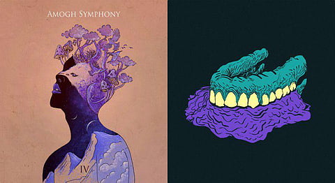
“Musicians should collaborate with artists more often. It helps the listener have a vision which is also synced with the artist/bands thought process. It can enhance and complete the experience as a whole and is also helpful for visual recall”, says Saloni Sinha who has worked with a bunch of artists including Amogh Symphony, Yatin Srivastava Project, Riatsu and more. Over the years, her style has evolved from a punk/gothic approach to a more imaginative and alternative narrative, drawing inspiration from nature, people and outer space. “Sometimes when I don’t have any brief from the band and they give me complete freedom, I try to draw cues from their lyrics, album title etc”, which worked out pretty well when Saloni worked on post-rock outfit Ioish’s ‘We Move The Sky’ EP, where she channeled the need to escape her mundane day job into a lush blue polar backdrop with a bunch of flying mantas.

VIII. Studio Kohl
“A lot of people want a graphic designer, but they don’t see that it’s really a piece of art rather than design. That’s why it’s called album art”, says Mira Malhotra, the creative mastermind behind Studio Kohl. A huge hip-hop and punk fan, Mira’s work is loud and colourful and exudes much of her inimitable goofy personality. She’s thus very particular about her collaborators and is keen on it being a ‘good fit’. So it was no surprise when she worked on fellow pop culture enthusiast, Tejas’ debut record, ‘Make It Happen’. Bonding over their love for Adult Swim, old Cartoon Network and retro video games, they came up with a one-of-a-kind gig poster for hardcore fans with intricate visuals for each track. She has also worked with a lot of brands including Sony, Mahindra Blues Festival and even Adidas’s ‘Pharrel Hu Holi’ collection artwork.

It’s highly unlikely that you’ve never come across Bloody Paper Boat’s work. This Mumbai-based brand development and design firm has done posters for VH1 Supersonic, Sulafest and even the likes of Slash and Skrillex India tours to name a few. Their work can range anywhere between something simple and to the point, to something other-worldly and rich. This is because creative head Rahul Dias isn’t bogged down by any particular ‘style’, as he explains. “I’m a huge believer in not just making it about cool designs, there’s always a need to communicate to your audience, whether it’s a message or information. Too often that gets lost in design.” But gig-posters seem like a different ball-game compared to album art. Rahul either tries to depict the vibe of the event or tries to evoke some kind of emotion from the viewer. All in all, it’s vital for him that his work stands out and draws some kind of attention in the visually saturated world of social media.

X. Suren Makkar
When you make a weird remix album in the 6th grade, just so you can do the album art yourself, you really can’t deny that there are some deep-rooted inclination for both the artistic pursuits. Suren Makkar, who goes by his producer name, Blindnight, is a member of Bangalore’s artist collective, Consolidate. Given that everything about Consolidate is in-house and DIY, it’s no surprise that Suren is also responsible for the crew’s branding. “Rahul[Consolidate figurehead] had ideas about the kind of look and feel he wanted for the branding. But we needed to put down some guidelines on how to approach this. We had decided we wanted something that is very simple but has a sort of presence and holds the space around it”, says Suren. After 40 odd sketches and an evolution to Aniruddh Menon’s[fellow Consolidate member] original design, Suren finally came up with Consolidate’s current logo, a fusion of piano keys and an elephant’s trunk. He feels pretty inadequate giving advice since he rekindled his passion for art and music only two years ago, but it’s safe to say that he’s doing pretty good for himself with his ‘Where’s The Fire’ EP from 2017 and his art direction and multidisciplinary design for Ather Energy.

XI. Visual Amnesia
An illustrious 14-year legacy of being a revered metal bassist of Undying Inc, almost half a decade as a Creative Head & Editor at India’s first rock magazine Rock Street Journal, can only be matched or surpassed by a 10 year legacy of being one of the most sought after and expressive visual artists in the country. Reuben Bhattacharya, who goes by the name of Visual Amnesia, is known for his richly detailed and almost surreal imagery inspired by mythology, dark art, pop culture and comics. He spends most of his days surrounded by music and art, which fuels his constantly evolving style. Beyond his paramount contribution to the visuals of the international metal scene (Slipknot, Textures, Skyharbor, Twelve Foot Ninja, Monuments & more), he has also worked on the album art of indie electronica/rock duo FuzzCulture, Shillong based gospel rock act Fireflood and even international acts like Australian synth artist, Future Fate. Leaving behind cushy jobs in the advertising, publishing and fashion industry, he started making art for music as a full-time independent creative. His only take being, “After almost a decade of doing this I can safely say it’s not easy, especially in today’s music industry. My key to survival has been to innovate and be open to try new ideas, because few things gave me as much creative satisfaction as making a piece of music come to life visually.”

XII. Hari & Deepti
I cherish the moments when I’m simply stunned by someone’s vision and artistry, and coming across Hari & Deepti’s work was definitely was one. The Mumbai based husband-wife duo’s remarkable papercut and backlit style is anything short of a spectacle. They simplistically mould paper and light into these highly imaginative and layered worlds. They are mostly known in the music space for their body of work with electronica producer, Sahej Bakshi, aka Dualist Inquiry. “We have worked with Sahej on 4 covers and each one has been an amazing experience. He is exceptionally passionate about his music and open to a lot of ideas with respect to the album art and we really appreciate that”, the duo explains. Their experimental physical installations are almost utopian in nature, however translate fantastically in the digital realm. Their shows take place in the dark with solely their pieces being lit, which leads to inspiring encounters like, “One of the best comments we ever received for our installation has been from a 7-year old kid who told his mother that he wants to live inside one of our works. That means a lot to us.” I wouldn’t lie, I feel the same way.

XIII. thebigfatminimalist
“It’s the idea of how something with a predominantly minimal quality could also be approached with a maximal sensibility,” Aniruddh Mehta explains his choice of moniker, which also happens to define his approach to work. Think equal amounts of balance and precision. Due to his struggle with sketching, his work has uniquely evolved and relies much on line work, geometry, repetition, balance, rhythm, and structure. Even though some of his earlier work had a lot of colour, Aniruddh currently explores his fascination with monochrome, helping him enunciate his forms and structures. Predominantly from a graphic design background, he has recently worked on the branding and identity design for the likes of Netflix’s ‘Sacred Games’. He’s also the man behind Boxout.fm’s ‘Control Sessions’. But his name in the visual space of music is predominantly known for his work with Qilla Records. “Qilla Records is probably my longest on-going project. Back when we (Kohra and I) were working on ideas, we decided to set a few visually dominant ground rules that would lay a strong foundation for the aesthetic, and then go nuts within those set guidelines. So the principle is always the same but we can approach it in infinite ways. This way the branding stays constant and the design always has room to evolve.”

XIV. Airphish/Pink Soda
It’s a little-disputed fact that Nucleya’s music has found a perfect partnership in some of the most heartfelt and captivating visual identities in recent times. The album cover trilogy for Koocha Monster, Bass Rani and Raja Baja are nothing short of iconic. From inspiring fan tattoos to a brand campaign in Egypt, these images have deeply percolated India’s pop-culture. And all credit goes to the brilliant mind’s eye of Smriti Choudhary, who goes by the name of Airphish. Having grown up in the beautiful cities of Bharatpur and Udaipur, Smriti has vivid memories of being surrounded by lakes, hills and waterfalls, which fuels much of her aesthetics. A lot of her personal work comprises of nature-inspired pencil drawn pieces, which finds itself in distinct contrasting to her more digital, colourful and symmetric work for Nucleya. For it, she drew heavily from Indian street elements and seasoned it with a sense of modernism, very much parallel to Nucleya’s soundscape. As she explains best, “what he does with his music, is what I wanted to achieve through visuals. The series of images capture the flavour of India through digital artworks, placed in modern context. I have taken my inspiration from the street and truck art of India, like the monster painted behind every truck became Koocha Monster. People see these graphic symbols everyday in India, I just put my own twist to it!”

If you liked this article, we suggest you read:
Raveena’s New Music Video Is A Fantastic Exploration Of Brown Skin & Sensuality
Spud In The Box’s Fantastic Visual & Sonic Universe
Tienas Is Indian Rap’s New Boy Wonder - Don’t Look Away Now