
- HOMEGROWN WORLD
- #HGCREATORS
- #HGEXPLORE
- #HGVOICES
- #HGSHOP
- CAREERS
- ABOUT US
- CONTACT US
I went to a hoity-toity international school in Mumbai. We were taught in English, conversed with each other in English, and dreamt in English. English is my first language, but it isn’t the language of my people. My parents are both from Chandigarh, and fluent in Punjabi. They seamlessly code-switch, using Punjabi to talk about me while I’m right there. For a long time, I saw this gap as a kind of accomplishment. Fluency in English seemed to signal refinement. It set me apart. Now, as an adult, I find that inability to read or write Gurmukhi embarrassing. I’ve grown up fluent in a borrowed language, and illiterate in my own.
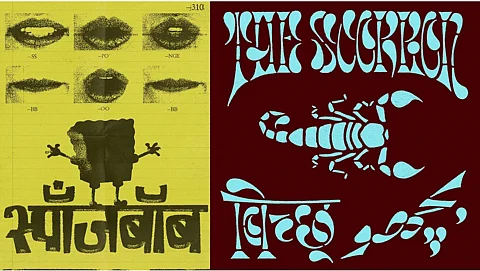
The dissonance between language, identity, and design is at the heart of a growing movement in India’s visual culture. Over the past few years, there has been a resurgence in the use of Indic scripts like Devanagari, across branding, design, and fashion. They’re being employed in playful, experimental, and aspirational ways, reflecting a broader reckoning with cultural legitimacy. To better understand this movement, we spoke to four type designers — Kimya Gandhi, Ishaan Nakate, Abhijit Menon, and Manav Dhiman — whose practices are grounded in the transformation of Indic scripts. The Latin alphabet has long reigned supreme — a byproduct of both globalisation and colonial residue. But type can challenge English’s hegemony across Indian design.
For all of them, the decision to work with Indic scripts began with curiosity and instinct. “I started experimenting with Indic scripts because my friends in communication design were doing it,” says Ishaan. “Over time, I noticed that type design with Indic scripts in India was very functional, but I was more interested in exploring form, aesthetics, and pushing letterforms in unexplored aesthetics.”
Kimya echoes a similar sentiment. During her master’s she encountered a professor interested in Asian design and “not just teaching Swiss design principles.” That shift in lens led her to ask a deeper question: what does it mean to be a designer from India? “It was the right place, right time — I saw the need for more aesthetic Indic scripts that could be used digitally.”
For Abhijit, the turn inward was also a turn away from design orthodoxy. “My ideas of graphic design were limited to the Western imports of ‘decluttered’ and ‘form follows function'. Being part of a creative industry that embodied those values didn’t appeal to me. Using Indic fonts helped me feel like I was creating something authentic and personal.”
Manav took a more “weird and strange” route. “We never saw Indic scripts used in cool or funky ways," he explains. "I wanted to push boundaries even if it was just one letter for fun.” His early experiments with Devanagari for brands like VegNonVeg became accidental acts of reimagination.
In each case, the decision to work with Indic scripts emerged a sense of visual and cultural dissonance instead of overt ideological commitments. This resurgence did not happen in a vacuum. Designers today are responding to, and participating in, a broader cultural shift — one that seeks to re-evaluate the aesthetics of identity and regional expression. “There is a newfound interest in representation,” Abhijit explains. “People from every part of the country want to be seen and heard.”
Kimya views it as part of a larger cultural re-evalutaion. “We’re slowly stepping back from blindly following Western trends. India has such a rich history — we’ve only scratched the surface.” But she also cautions against naive celebration: “Indian design sometimes sways from being indifferent to extremely fascist. You never know where decisions stem from.”
Manav goes a step further, framing the boom as potentially tokenistic: “A lot of brands are doing it as a marketing gimmick.” Still, he acknowledges its practical impact: “Bigger brands are waking up to the idea that they can’t just speak to Delhi or Bombay. They want to reach Coimbatore or Cochin — and language helps them do that.”
Ishaan is more blunt in his critique. “A lot of usage still feels surface-level — used more for visual appeal than as part of a system. Until Indic scripts are used in aspirational contexts without needing to feel ‘vernacular’, it’s not a full shift — it’s just the start.”
What, then, does this revival mean at a deeper cultural level? Can type design shift perceptions of linguistic legitimacy? Can it unsettle the inherited hierarchy that places English — and by extension, Latin script — at the top? “Type design alone can’t decolonise anything,” Ishaan says. “But it plays a role. Scripts hold memory and identity.”
Manav chooses to similarly resisit grandiosity. “My stupid work is not decolonising the nation. But if people push it forward, it becomes a part of reclaiming our own heritage.”
For Kimya, the personal is political: “I grew up feeling inferior because I wasn’t fluent in English. That colonial hangover is real. I try to make sure Indic scripts look fun, fresh — not just ‘traditional.’ ”
Abhijit complicates the binary. “As Indians, we don’t need to have a complicated relationship with English. But I give Indic scripts equal importance. Drawing them side by side often leads to a cross-pollination of ideas.”
The point is not to overthrow Latin, but to rebalance the equation — so that Indic scripts are not relegated to the dusty corners of textbooks and state signage, but are instead seen as contemporary. Younger designers today are far more excited to see new Indic typefaces, breaking the inferiority complexes that haunted older generations. Type, then, becomes not just form or function, but a feeling, a place marker and a language of belonging.
If this revival endures, it will be because people saw these letters as living, shifting carriers of meaning. For me, I don’t need to read Gurmukhi to feel a sense of home in it. That’s what good design really does — it lets you see yourself, even in a script you can’t read. While decolonisation is great to meditate upon, this homegrown movement is about something smaller: the right to see yourself in type, and the right to be ordinary in your own script.