
- HOMEGROWN WORLD
- #HGCREATORS
- #HGEXPLORE
- #HGVOICES
- #HGSHOP
- CAREERS
- ABOUT US
- CONTACT US
Since the dawn of mankind, we’ve been presented with opportunities to create solutions that allow us to lead easier, more productive and markedly more joyful lives. And while everything we’ve created since then comes in a great manner of shapes, forms and sizes, there’s something to be said about solutions that combine both form and function; that utilize impeccable, holistic 360-degree design thinking which ensures a sublime marriage of aesthetic appeal and intuitive real-world applicability.
Few companies understand this better than CRED, the Indian fintech unicorn that’s made a sizeable impact on both the fintech world, with their reward-based credit payment solutions and on popular culture with a series of advertisements that have honed in on and captured the nuanced and easily misinterpreted irreverence of the millennial and Gen-Z artistic and creative zeitgeist. For them, design must spark joy, excite, inspire as well as be able to reach out and touch the collective imagination and vision of people across the world; transcending the boundaries of language, identity, and culture.
The power of art to transcend the boundaries of time and find relevance across centuries is something that has been well documented by both Homegrown and our contemporaries. In keeping with their idea for an artistic revolution among consumer-oriented design thinking, CRED has found what it believes will be its Renaissance moment; the spark that will light the flame for creative solutions across the country and exponentially augment its customers’ experiences.
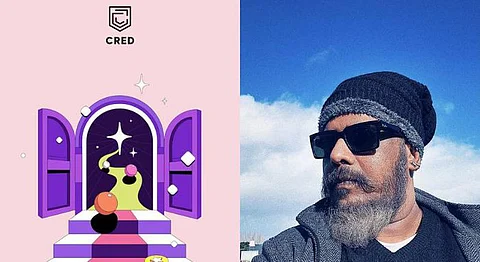
It recently launched ‘NeoPop’; a 4th generation design system that’s been inspired by its namesake art movement, that in turn created a nexus between what was then considered ‘everyday pop culture art’ and ‘high art’. NeoPop and its UI library, ‘Cheesecake’, exist at the intersection of works of art that are a result of passion and works of art that inspire passion.
With an increasing number of individuals across the globe relying more and more on online services for the purposes of shopping, streaming and more, there’s a clear demand for a solution that breaks the mould; providing an easily distinguishable, captivating user experience with real-world applicability existing as a part of its fundamental DNA.
In a fascinating, free-ranging interview, we sat down with CRED’s visionary and enigmatic Head of Design, Harish Sivaramakrishnan and Head of Mobile Tech, Ketan Jogani to talk about what makes NeoPop as easy on the eye as it is to use in the palm of your hands.

“Great questions lead to great design.” What were the questions you asked to shape CRED’s design philosophy? How do you view your personal design ethos compared to that of CRED as the lead designer?
Harish: Some of the initial questions we’d considered while building CRED were, how is designing for the top 10% different from designing for the masses? How do we create premium experiences via digital? And if design should focus on utility or strike a balance between utility and aesthetics. These questions helped us determine the path we at CRED needed to take in terms of product design. I’m of the opinion that great design is rooted in instinct.
My outlook towards design has always been to build on instinct and later measure and correct based on data. One of the best parts of working at CRED is not having to separate my personal design ethos from what I need to drive as Head of Design. I’ve been given creative freedom and control and this has resulted in every design update being treated as a passion project
At CRED, there is a conscious narrative wherein creativity inspires functionality and vice versa; how do you find yourself striking the right balance to build an intuitive user experience?
Harish: Through the years, one of the most critical outcomes of design- that it should solve a problem has been confused with design itself. Design’s purpose stretches way beyond just solving a problem. For us, design should inspire creativity, design should bring out emotions, design should delight, design should seek a purpose beyond the most obvious and most importantly, design should touch humans in ways beyond our collective imagination.
We envision CRED as a mall that has various offerings for members – ranging from arcades, shopping, and financial services. When you envision CRED as a destination, it’s important that it has personality – which members find hard to ignore. This personality is provided by design.
Our new design language, while being bold and expressive, attempts to inspire our members to feel and perceive their everyday tasks or even everyday objects with a sense of artistry and delight. For a category-breaking, genre-bending product like CRED, which has offerings as diverse as payments to e-commerce, arcades to investments – our design language is a powerful glue that binds together our member experience in an unconventional yet incredibly consistent way.
You’ve now launched the 4th generation design system ‘NeoPop’ and it’s directly inspired by the aesthetic and pulse of the neo-pop art movement. Why this specific movement? We are curious to learn about the germination of the inspiration.
Harish: NeoPop is inspired by the philosophy and aesthetic principles of the Neo-Pop movement, which created a profound impact on the evolution of art. The Neo-Pop movement has roots that go back to the Edo period of Japan and more recently to the Superflat movement started by Takashi Murakami. NeoPop artists worked to democratise ‘high art’ and present everyday objects in a beautiful way. In a way, the Neo-Pop movement broke the conventions of what art was perceived to be. This is what we’re trying to do at CRED through our various design updates – take beautiful designs and make them accessible to members. At the core of NeoPop is the idea of taking everyday objects and elevating them to art.
While there are works of passion, and works that inspire passion – the launch of NeoPop is at the intersection of both. With this new update, members get to experience CRED in a sleek new design language that makes it as much of a treat to use, as it is to look at.
Can you talk about the engineering behind NeoPop?
Ketan: Our brand new UI framework - Cheesecake is engineered to bring the magic of NeoPop to life. At the core of every engineering solution we build, every single line of code that we write, there is an ever-burning desire to bring art to life; to make it perceptible to our members every time they open the app, touch a button or move a slider; making every aesthetically crafted experience work like magic, with pixel perfection. Cheesecake is a sophisticated, feature-rich, and densely packed library that every developer can easily consume. Few lines of code can get you 3-dimensional buttons floating in space, gorgeous screens in motion that can render videos parallelly and thoughts from designers’ minds directly onto the pixels on your device.
The core essence of Cheesecake is a centralized framework that is built to be re-usable, backwards compatible and easily pluggable anywhere with carefully crafted components that run the gamut from fonts, colours, and spacing to videos, complex motion guidelines, carousels and more. We have stepped outside the norm to render impossible designs using OpenGL and SceneKit leveraging the full power of the GPU – something that was only meant to be used by games and other intense workflows. Building frameworks and systems that innately help us create fast, with confidence is central to our philosophy. Cheesecake makes our app look great and helps it to work great but it also makes it incredibly fast, effective, and easy to build on top of.
Design is subjective and with critics abound; how do you view and adapt to the critique of design?
Harish & Ketan: The need to build with great artistry, craftsmanship, and passion has led us to push our envelope several times through our journey. We are cognizant of the fact that any change brings with it resistance and uncertainty. When it comes to user feedback, we don’t do conventional testing. We develop high fidelity prototypes that are fully clickthrough and share these with beta groups who use and share valuable feedback on the update. We do something called dogfooding – where we internally test out the feature with a close-knit beta testing group. This involves a rigorous feedback process, where we test every little thing. We’ll never be the ones to run mock screens by members. Testing with members doesn’t give them a get a chance to experience the entire update. It’s like sharing a scratch track and asking listeners for feedback – it doesn’t work. The onus is on us to understand our audience and develop features based on their needs. We might not always get things right – but that is where measurement and data can bring us back on track. We have utmost faith in our research and strategy and our members have been the biggest pillar of support; enabling us to work harder, learn from our mistakes, and continuously push the boundaries on what’s possible. They’ve been our most vocal supporters, most vocal critics, and most valued evangelists.
That said, criticism doesn’t deter us from continuing to innovate, and it shouldn’t either – otherwise, we’ll never be able to bring about any innovation that actually makes a difference. Unless you embrace change, you will remain incremental.
All design evokes some kind of emotion; positive and visceral; well, that’s the intent. How do you believe the NeoPop interface builds beyond the functionality and stirs creativity; what does it hope for people to feel and resonate with?
Harish: NeoPop is a design interface that delivers a better focus on information. This helps users easily identify the most important elements on a page. From the fonts, textures used and interaction animation – this design update is geared to mimic the real environment and recreate real-world experiences. New elements have been designed to increase engagement, showcase maximum information, and optimize the space available on our mobile screens. Since a physical UI metaphor makes designing for speed and cross-communication between various lines of the business complex making all elements fit into a skeuomorphic design is unviable from an operational standpoint.
With NeoPop, we wanted to develop a visual language that is easily scalable. This allows design to evolve, adapt quickly, and cater to various offerings that are launched on CRED. Finally, our beautiful and performant new motion design framework helps us create bespoke visual stories while staying time-efficient. Visual storytelling with great motion design has been intrinsic to the CRED experience from day one. All things considered, our ultimate goal with NeoPop is to have every screen on the app feel like a work of art that you’d consider framing on your drawing-room wall.
Do you have initial thoughts and inspiration points on the evolution to stage 5? Or is it too premature a question?
Harish & Ketan: A lot of companies consider themselves to be engineering or product-driven. We don’t shy away from the fact that we’re a design-first company. We understand that visual appeal plays a big role in how people perceive and react to things. This is why all our teams from the ‘design mafia’ to frontend engineering work together to execute regular design updates for CRED. Why do we do this? Simply put, we do this to meet the needs of our members and the business. Given how CRED has grown from an app facilitating credit card bill payments to one that offers a wide range of offerings across commerce and finance – design needs to evolve rapidly to meet changing expectations and needs. As these needs change, we find ways to cater to them through beautiful and performant design. While it is premature to think about the next stage in our design evolution, should the needs of members and the business require such a change, we’ll be the first ones to initiate it.
If CRED’s design was to be captured in 3 words, what would they be?
Harish and Ketan: Bespoke, Delightful, Engaging.
Coming back to your personal journey as a designer, where did it all begin? Tell us about what drove you towards adopting a career in design.
Harish: To a large extent, my focus on design was driven as a result of pursuing performance arts/music. While I worked at and led design teams across numerous companies, I was tired and saturated by building for scale. When the opportunity to lead design for CRED presented itself, I was intrigued by the proposition of building for a defined cohort of users. The design choices made when your target addressable market is small are very different from when you’re building for a broad spectrum of people. It allowed me to do craftier and innovative work which I was deeply passionate about.
India is on the brink of an exciting future of art, design and creativity. What do you think the future has in store for the industry?
Harish: When I look at the progression of design in India, I see many designers reluctant to bring about change, as they’re sceptical about how this will be received by consumers. We need to come to terms with the fact that fighting inertia through design is a good thing. The design needs to move beyond just functionality – towards creating moments of delight for consumers.
Well thought out design rooted in human insights brings up an emotive response from consumers. This response is deeply memorable and helps consumers create a connection with a product or solution. While these goals are non-quantifiable to an extent, prioritising these along with quantifiable metrics will enable design to have a much more meaningful impact on our lives. Increasing awareness of these aspects and driving this change in outlook towards design (amongst consumers and product developers) will bring to the precipice the exciting journey outlined for design in India.
Who would be your influences in the field of design?
Harish: While there are many influences to call out, Airbnb’s product and design philosophy is one that I gravitate towards. The app’s design is reflective of its focus on community – being a host and being served by a host. Design helps Airbnb articulate its community narrative, as opposed to the platform being looked at as an aggregator of travel properties. I think this is a great example of the role design can play in shaping products and it has inspired me deeply.
If you enjoyed reading this, we suggest you also read: