
- HOMEGROWN WORLD
- #HGCREATORS
- #HGEXPLORE
- #HGVOICES
- #HGSHOP
- CAREERS
- ABOUT US
- CONTACT US
When I open Google Documents to begin writing an article there’s always a small ritual I follow. Switch Arial out for Bolded Playfair Display in 11 point, contemplate whether I want it in the colour black or navy blue, only to end up settling on the navy, as per usual. I can’t explain this somewhat odd mini-tradition. Or why it warms the synapses of my brain just right to that temperature perfectly conducive to start writing. I do know that the power of typography is at the core of it. An element of design so seemingly small, yet so tall in its ability to impact how we feel. Even how we interpret.
[Sidenote: I use Papyrus for when I have a very tight deadline so the text annoys me into wanting to finish it as soon as I can.]
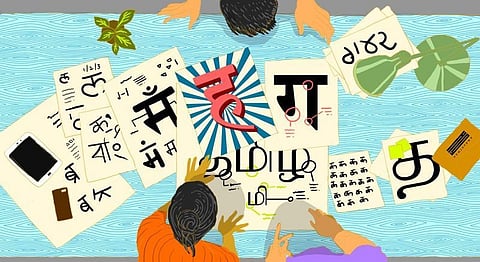
Now that confession hour is out of the way, however, we can focus on the matter at hand and its very interesting evolution in the multiverse that is India. When a country is home to more languages than it even knows of [think everything from a clan in Gujarat whose language revealed Japanese ancestry, to a tribal language called Gondi which was found to be as sophisticated as French with its wealth of proverbs] you might think the art and design of Typography would be almost intrinsically developed within us. And it has been, in many ways. But given the nature of the medium itself, not to mention that regression is as inevitable as progression here, it has had its own share of road-bumps to deal with. “Bad typography is everywhere, good typography is invisible,” sums up award-winning typographer Craig Ward; far better than an Arial-or-Playfair Type noob ever could.
So what is type, anyway?
Typography is all around you. From your grocery shop’s signboard, movie posters, and business cards to generic road signs and your social media pages, it’s an undercurrent in your life in the way that very few other design-elements are, impacting and influencing you in ways that you don’t even realise. Essentially, type would encompass using one style or standardisation to letter-forms in any language it is written in. It involves creating a system of those letterforms and designs then applying it to different application depending on the ‘clients’ and their needs. Sarang Kulkarni, Type Designer & Co-founder of Ek Type, echoes many of these sentiments as well, saying, “If the content can be read and comprehended with ease, that’s good typography. Decorative fonts catch people’s eye but when you can’t simply get the message from it, then you become aware of the design and focus on its issues instead.”

Think about this for a moment – you’re handed a business card of a doctor you just happened to meet. In times of need, would you call the doctor who used Comic Sans on his business card? Most likely, it’s a no. Why? Because Comic Sans puts forth a visual identity that seems playful. Cartoonish, even. For most people, these aren’t the qualities you’d want to associate with your doctor. You’d expect something bolder, strong and powerful, maybe a Serif font that portrays seriousness and trust, so to speak. Though it doesn’t get the credit it deserves, typography is just as powerful in its ability to communicate and create a brand identity as a logo.
Kulkarni started out with establishing a design firm and type foundry back in 2005, but back then, he explains, hardly any people used to get type design done. Ek Type was set up in 2015 serving as a platform for young designers to learn type design, do collaborations and work on multilingual projects. “In India, when printing started, so did typography. Today, it has grown into a large arena with digitisation. Everybody has a cellphone, television and computers. Here, clients can control everything and they want new fonts and designs to experiment with,” he explains. “We’ve come a long way from hand-painted lettering before printing came into being.”
While Kulkarni says that one cannot consider hand-painted letters as typography, such as that of old-school Bollywood posters, Vikramaditya Sharma, Co-Founder & Creative Director at Ampersand Design, believes otherwise. “For me, anything made of letters is typography. Old-school Bollywood posters are not what I’d think of as traditional typography but a different kind of representation of it. You can’t replicate this exactly in a predefined system. Like a digital type, there will be imperfections. But hand-making and handwriting is still a large part of Indian culture, and that reflects in the kind of typography being produced as well so it does need to be taken into consideration when you look at the traditional visual designing of words in any Indian script. In this regard, the work Hanif Kureshi is doing is very important, in terms of preservation,” he explains.
Kureshi’s project HandpaintedType is a collaborative project working towards preserving the typography works of street painters around the country through the digitisation of their work for use. “These painters, with the advent of local DTP (Desktop Publishers) shops, are rapidly going out of business with many of them switching to the quicker, cheaper but uglier vinyl. Many painters have given up their practice altogether. The project involves “documenting the typefaces of roadside painters across India and digitizing it so that it serves as a resource for present and future generations,” the website states.
Sharma explains that type designs can be very reflective of where we’re standing in the cultural, societal and aesthetic timeline of thoughts and ideas. We’ve come a long way from Gothic script Blackletter that he says was used for Bibles. “It was ornamental, not as legible, a lot more regal, and that suits the content and context. Later on, as you look at the different periods of artistic expression, cultural revolutions as well, you see its effects on the kind of typography that was used.”
It is still comparatively recent that typography as an art established itself in India. There are a number of designers and firms in India that are doing some incredible type work and have made a name for themselves in the global market. The Indian Type Foundry (ITF) is among these firms, founded by Satya Rajpurohit and Peter Biľak, which has a long list of international and Indian clients including Apple, Google, Starbucks, Reliance, Airtel and Panasonic, among others. ITF has developed a number of typefaces for major Indian scripts like Devanagari, Gujarati, Bengali, Tamil and Telugu, among others, and, as Typotheque points out, also aims to serve as an educational and information platform in a bid to bring the community together and promote Indian typography to get the same recognition and attention that latin typography has gotten over the years.
But creating and designing Indian typefaces is a lot more complex than the English language. “You have a lot more letters, ligatures to alphabets, connectors, and these have their own set of problems. Hindi, for example, is a connecting script, unlike English. There is a line over the alphabets that connect them together, and here matters of spacing alphabets or letters become more complicated. How we add punctuation, put a matra after a letter or chandrabindu, these all play a part in the design,” Sharma explains. He further adds that the initial obstacle is that a lot of designers in India study at art schools abroad. “There you will learn typography in English, with its respective principles, guidelines and directions. Western typography and type invention came first so to speak when we look at the world of typography, and much later the conversation regarding any other language or script happened. So we all, in India, adopted these western notions and ideas and then apply them to create Indian script. So in a way, a designer’s first instinct is to design in English, in which they learnt their rules, but of course, this doesn’t apply to everyone.”
Such a notion, he says, also makes it a little difficult to define what exactly ‘Indian typography’ is, but there has definitely been a shift in the Indian design world to start working with local and regional languages, albeit being a small pool of designers. A major change happened when India went digital and, with the advent of this digitisation, there was an increase in consumption. “The spread of the internet and its usage in India has created a larger audience, and in turn, a larger market. Any company or brand who wants to go pan India requires multilingual communication. People who only focus on English end up catering to fewer cities in comparison. Indian typography’s need for multilingual matching fonts is increasing day by day,” says Kulkarni. He gives an example of the Star group of channels. “There’s Star Gold and Star Sports but they also have channels in regional languages for which they require the name under the logo to be in that script. But they also need consistency, so the same type and design of let’s say in English would have to be created and designed in Hindi, Marathi, and any other language in the same font to maintain that consistency in the brand’s image.”
Typography is more than just Arial and the fonts we use on Microsoft Word. It is the art of designing a visual identity through language. For a brand or company, its colours, shapes and form are very much the same as the clothes we wear and how you style or colour your hair – it visualises to the world who you are. You can easily identify the adidas font as you would their logo. In an age of smartphones and short attention spans, it can encourage people to read with clear and simple, yet attractive design. You can control the sequence in which readers take in the content with its arrangement and weight. There are so many nuances in the shape of letterform that affect how information is perceived.
Type designers have the ability to revive dying languages, in a way, like Sanskrit for example. Creating beautiful Sanskrit typefaces, even if solely for visual purposes through videos or campaigns and such, can create an awareness of the language and its beauty.
This is precisely the power of typography and why good typefaces deserve the unique space they’re carving for themselves in the world, today.
With inputs from Sarang Kulkarni (Ek Type) and Vikramaditya Sharma (Ampersand Design)
If you enjoyed this article, we suggest you read: