
- HOMEGROWN WORLD
- #HGCREATORS
- #HGEXPLORE
- #HGVOICES
- #HGSHOP
- CAREERS
- ABOUT US
- CONTACT US

Long before digital fonts and graphics dominated Indian cities, streets were typographic playgrounds shaped by sign painters, calligraphers, and print-makers. From hand-painted vernacular signs to modern multi-script typefaces for global legibility, Indian typography has evolved through craft, colonial influence, post-independence modernism, and digital design. This is the story of how brushstrokes became Bézier curves, and how the past still influences the present.
“The shops, even when small, even when dingy, had big, bright signboards, many-coloured, inventive, accomplished, the work of men with a feeling for both Roman and Sanskrit (or Devanagari) letters,” V.S. Naipaul wrote in his travel memoir, ‘India: A Million Mutinies Now’, in 1990.
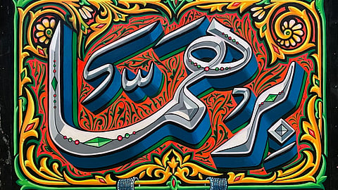
Once, hand-painted signs and letters — on tin sheets, plywood signboards, cinema hoardings, and the sides and backs of buses and trucks — were ubiquitous in Indian cities and towns. Across the subcontinent, sign painters developed hyperlocal typographic dialects in Devanagari, Bengali, Tamil, Gujarati, Gurmukhi, and Urdu — necessitated by the diversity of India’s regional languages and their scripts, and by the absence of ready-to-use typefaces in these languages. Their letters were elastic and improvisational, built for speed and visibility, and shaped by the demands of legibility in a crowded street. Even today, the typographic landscape of Indian streets forms a living, breathing archive of Indian visual culture.
India’s typographic history is not a straight line from traditional hand-lettering to modern type design. It is layered, multilingual, and deeply connected with craft, commerce, colonial print culture, and contemporary digital infrastructure. Here, hand-painted signage co-exist alongside their computer-generated modern counterparts, and stand testament to the many ruptures that continue to shape our visual culture.
In the pre-modern and early-modern periods, hand-painted signs and letters sat at the intersection of literacy, labour, technology, and commerce. They were practical solutions to specific historical conditions. Until the late 19th and early 20th centuries, printing infrastructure in India was unevenly distributed and expensive. While presses existed in colonial administrative centres, small traders, shopkeepers, and local businesses could not easily access custom printed signage, especially in regional scripts. Hand painting and lettering was faster, cheaper, and locally available. Even well into the late 20th century, before affordable vinyl printing and digital plotters, commissioning a sign painter was more economical than typesetting and printing large-format signboards and posters.
But as metal type and mechanised printing became more accessible, letterforms were rationalised to fit industrial systems, flattening the fluidity of calligraphic traditions. The first shifts towards easily reproduced commercial types happened during this time.
After 1947, typography became part of independent India’s nation-building efforts as national institutions, public sector undertakings, and publishers required coherent visual identities. Satyajit Ray emerged as a pivotal figure during this period. Beyond cinema, he designed book covers, Roman and Bengali typefaces, and calligraphic logotypes that merged modernist clarity with regional script sensitivity. His work suggested that Indian typography could be modern without mimicking Western grids. Design education institutions like the National Institute of Design (NID) further shaped typographic discourse, introducing structured thinking around visual communication while still engaging Indian scripts.
In the 1990s and early 2000s, R. K. Joshi revolutionised Indic typography by moving it from the fragile margins of hand-lettering, print, and proprietary encoding systems into the core infrastructure of digital computing. Trained as a calligrapher and graphic designer, he understood that Indic scripts like Devanagari, Gujarati, and Kannada were not simply alphabets but complex visual systems governed by conjuncts, ligatures, and spatial relationships.
At a time when most software environments were built around the linear logic of the Latin alphabet, Joshi worked to ensure that Indian scripts were not flattened or awkwardly retrofitted into unsuitable frameworks. His involvement in developing widely distributed system fonts for Indian languages helped integrate these scripts into mainstream operating systems, making multilingual computing accessible to millions. He reframed Indic typography as a site of rigorous design inquiry rather than ornamental tradition, influencing a generation of designers to approach type as both cultural heritage and technological system.
Contemporary foundries and projects like Indian Type Foundry and Handpainted Type, founded by the late Hanief Kureishi, have since professionalised multi-script type design, producing families that move fluidly between print and screen, corporate branding and editorial layouts. Indian typography today is infrastructural — embedded in operating systems, apps, and global communication networks.
And yet, the hand-painted signboard has not entirely disappeared from India. In recent years, artists, designers, and photographers — such as Aradhana Seth, Pooja Saxena, and Aashim Tyagi — have documented and archived India’s vanishing street lettering traditions, recognising them as endangered cultural forms through their respective projects. The cultural backlash against the overwhelming automation of the world has also translated to a renewed interest in the irregularities of the human hand. Seen within this context, Indian typography’s evolution is not a clean arc from craft to code. It is a negotiation between the informal and the institutional, the regional and the global, and the hand and the machine. Every letterform carries within it histories of labour, technology, and power. To trace its trajectory is to confront how language itself is shaped and how we read the world we live in.