
- HOMEGROWN WORLD
- #HGCREATORS
- #HGEXPLORE
- #HGVOICES
- #HGSHOP
- CAREERS
- ABOUT US
- CONTACT US
How do you make a heritage dosa spot feel fresh and exciting in a city with a culinary attention span as short as it is crowded? That’s the conundrum that Reshmy Kurian and the team behind Bandra’s (and now Juhu’s) Benne appear to have solved. This meticulous approach to creating and evolving not just the space’s aesthetic and feel, but also their overarching brand philosophy and ethos, was spearheaded by the multidisciplinary homegrown designer, who used her specialised user-centred-design background to help Benne realise the full potential of its vision.
Since it opened, it has garnered a cult-following among Mumbai’s denizens and has seen jaw-droppingly long lines stretching across the entire street since it opened. Patrons across the city have been won over by its warmth, simplicity, community, and its unwavering commitment to the nuances and the artistry of authentically rooted Bengaluru daily staples.
When you walk into Benne, there’s a cultural rootedness that’s clear to see. It has the core trappings of a conventional dosa spot, but it never feels ‘in your face’ or overly extravagant. Everything from its earthy tiles to its traditional shutters and community tables are interspersed with modern flourishes like interactive kiosks and a cosy but state-of-the-art kitchen. It’s inspired by Bengaluru heritage but is still inseparably interwoven into the cultural and aesthetic of Mumbai’s larger culinary and design landscape; a delectable, complementary hybrid of two maximum cities.
Despite looking somewhat laid back and effortless once they’re up and running, exceptional spots like Benne are rarely ever built overnight or on a whim. They’re the result of weeks and months of research, strategy, conceptualisation and a comprehensive design-centric approach that encapsulates every facet of the founders’ vision while addressing potential blind spots and problem areas.
We sat down with Reshmy recently to talk about the creation, execution, sustenance, and evolution of Benne, along with her nuanced approach to both design and brand building across the homegrown creative and brand economy and beyond.
Reshmy, if you could take us back to the very beginning, how did the brand and design process unfold for Benne? With your roots from NID, design thinking must be second nature, how did you apply that to something as culturally familiar as dosa, while making it feel new and aspirational?
When Akhil and Shriya (Akhil Iyer & Shriya Narayan, Benne's co-founders) told me they wanted to start a dosa place, I was both excited and a little apprehensive. Akhil had been talking passionately about the gorgeous Bangalore dosa for years, and they had clarity on the business model and a strong gut feeling that there was a market for it. My instinct was that we could build something great, but I also knew that if we didn’t ask the right questions upfront, we might just end up being another dosa joint in a city already full of them.
To start with, I spend time listening. Investigating. Helping clients articulate where they come from and where they want to go — and along the way, I surface what needs to be solved or clarified before a brand can come alive. It’s my job to ask the right questions. Especially the hard, uncomfortable ones. To point out the blind spots that are easy to miss when you’re building from passion. And then, to help identify the design problems the brand needs to solve, problems that often sit beneath the surface as untested assumptions or emotional contradictions. Because that’s what branding should do: solve the invisible problems. It should bridge the gap between the founder’s dream and the customer’s lived experience. Design isn’t just about how something looks; it’s about how it works, and why it matters.
Through a five-day deep-dive brand workshop, we explored vision, values, market understanding, competitive landscape, customer behaviour, and long-term dreams. A few things became clear. First, while the dosa itself was unique, we had to reintroduce it in a way that felt fresh — especially in a city where South Indian food is already everywhere. Second, we had to be razor-sharp about the business format. Akhil and Shriya were clear: this was going to be a QSR — quick, affordable, and welcoming to everyone. To my mind, that decision brought its own creative challenge in separating ourselves from the plethora of affordable South Indian restaurants. We had to make the dosa feel cool, culturally rooted, and relevant to a new generation, without it losing its soul. And the third flowed from there — we needed to create an identity that was both traditional and modern, both Indian and international. So that’s what we set out to do.
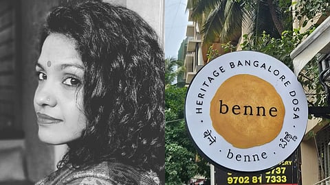
Every element of the brand system was built to reflect this emerging brand strategy: the logo, colour and font palettes, story, the tone and voice, the spatial experience, the visual and material language, the content, the packaging, and the uniforms. The name — Benne, which means butter in Kannada — came from Akhil during an exercise in the workshop. It’s a simple word, but evocative. It’s sensory, regional, yet modern-sounding. Somehow, it’s also instantly lovable.
Similarly, the tagline — ‘Heritage Bangalore Dosa’ — checked off several goals we had articulated for the strategy. Every single touchpoint had to reinforce the same idea and brand story: Benne was a place built by two young people who were not from the hospitality industry, but who deeply missed the Dosa they grew up with. This needed to be the place where passion meets hard work and where heritage meets now.
For you, what’s the difference between ‘creating a restaurant’ and ‘building a brand’? Across India, we are witnessing an incomparable number of restaurants emerging. Why do you think so many F&B spaces skip the brand part? What is the biggest blind spot that most food entrepreneurs tend to miss before launching?
The difference between setting up a restaurant and building a brand comes down to intention. A restaurant can serve good food, but a brand tells a story — one that people want to be part of. And for that, you need clarity on your ‘why’.
Simon Sinek put it simply: People don’t buy what you do, they buy why you do it. In the age of Instagram and personality cults, this holds more power than ever. It's something I hold central to my work. The first question I ask any founder is: Why do you want to build this? Not what’s on the menu, not what the interiors will look like—just, why. And where did it start from?
And this is what I've learned: a lot of food entrepreneurs don’t really have a clear answer to the why. All too often, they are inspired by a format that worked somewhere else, or they’re chasing a trend. But if your reason is just “because it’s blown up everywhere,” you’re already building from someone else’s blueprint.
I don't mean to discourage anyone. On the contrary, I ask this because I need them to get to their own truth before I can help them build a brand. Only after we uncover what they uniquely bring to the table can I translate that into a brand. And if you really want to build something disruptive; something that stands out and lasts — you have to be willing to think differently. You have to have the courage to throw your weight behind your own vision, even if it feels risky. That clarity, that commitment — that’s what makes a brand unforgettable.
The biggest blind spot I see? People don’t realise that branding isn’t just about a logo and a colour palette. It’s going to entail a lot of serious conversation about what you are doing and why. It will end up shaping every part of the experience from the ground up — and without that, the logo and colour palette are as good as a squiggle. They are not really going to be doing much for you.
How did you approach translating regional, Bengaluru nostalgia into visual cues for a new consumer? How did you protect authenticity while still making it relevant to a contemporary, evolving palette? Also, how important was it for you that the space invites community, rather than just customers, and how did that influence your design strategy and choices?
One of the first things I realised from early research is that Bangalore doesn’t come with as many ready-made, easily recognisable visual markers as some other Indian cities. And that turned out to be a gift — because it allowed me to go after a feeling, rather than rely on surface cues.
I knew I didn’t want to lean into stereotypes. No carved pillars. No Athangudi tiles. No overly staged ‘South Indian’ aesthetic. That kind of literal representation can feel performative — and often, it flattens the culture rather than honouring it. So I made a conscious decision to design through evocation, not depiction.
The materials we chose were traditional, but not always used traditionally. Whether it was a certain kind of wood, a textured wall, or a handcrafted brass light, the intention was to evoke memory and ground it in texture, colour and form through compositions and contexts that felt familiar and yet fresh. Something that felt like a Bangalore bungalow, reimagined for Mumbai’s cluttered urban fabric. The fonts chosen were classic but not decorative and the colours we went with were earthy and rooted. Motifs drew from nature and ingredients, not iconography or city references.
And, yes, a sense of community was central to the vision. We weren’t designing a transactional food space — we had discussed early on that we wanted to create a place of connection and memory. A space where people felt both curious and comforted.
Ultimately, brand design isn’t just about what you see. It’s about what you feel. It’s about whether you remember that feeling and want to come back, not just for the food, but for what the place holds. That Akhil and Shriya were unafraid to do things differently, trusted me completely, ideated with passion, thought through every comment or idea I brought up and threw their weight behind each idea to take it to fruition made all the difference.
Beyond the physical design and the logo, how do you build ‘brand culture’ across the lines of an organisation: inside the kitchen, with staff, and within the customer experience?
This is such an important question — and one that often gets overlooked. Two of the most underestimated pieces of brand architecture are the purpose statement and the brand values. They’re often treated like a slide on a deck. But in reality, they’re the foundation.
For me, purpose and values are not things you add after the visuals are done. They come before. Before personality. Before tone. Before strategy. Because everything else, including, but not limited to, design decisions: what you communicate, how you say it, how you hire, how you serve, what you serve, and how you grow, has to align with them. That’s how culture is built.
Ultimately, culture flows from the top. If the founders aren’t clear on what they stand for or if they aren’t consistent in living those values, the brand feels hollow. But when values are real and operationalised, they show up everywhere.
As startups like Benne grow, how do you ensure the design language and cultural essence stay intact while coming into new neighbourhoods like Juhu or even new cities?
A brand isn’t a fixed thing — it’s a living system. Especially for startups, the early phase is full of feedback loops, new learnings, serendipitous discoveries, and unexpected insights. So the real challenge isn’t just consistency —it’s knowing what to hold tight, and what to let evolve.
Before we began work on the Juhu outlet, I did a brand check-in session with the team. We revisited the brand book together and asked: Has anything shifted since we launched in Bandra? What does the team now know — about the customers, the team, or even themselves—that we didn’t know then? Do we want to refine anything? Or reaffirm it? That session was important — not just to realign, but to re-commit to the essence of what we were building.
When we started ideating on the Juhu space, I reiterated that it was important that each branch of Benne felt like it was a different room in the same house.
Your values and your core personality stay steady, but how they show up in a new space might shift in expression. The key is to be intentional. You can grow but you have to stay mindful of how far you’re stretching, and what that stretch is doing to the brand.
You’ve helped shape something deeply rooted in food and regional identity with Benne, but brand thinking is universal. From a dosa or digital products, design thinking and storytelling sit at the core of any meaningful brand. Founders often go after product-market fit and keep brand thinking for later. In your view, why does starting with brand building give you an unfair advantage irrespective of the category, whether it’s tech, consumer goods, or services?
A brand is essentially a personality. It’s the impression someone forms about who you are—and it shapes what they think of you and whether or not they’ll trust you.
And just like with people, if someone shows up differently every time you meet them — if their words, actions, and energy are never quite aligned — you’re less likely to trust them. And if you don’t trust someone, you’re not going to invest your time, attention, or money in them.
Many founders think investing time and money in branding can wait — until launch, until growth, until it’s ‘really needed’ but in my experience, if you start with brand work, you build more intentionally from the beginning. You recognise what problems you need to solve, what challenges you need to address in your communication. If your brand foundation is minimal or weak, marketing has to work twice as hard to get you customers. And you waste time and money fixing confusion, walking back misaligned decisions, or trying to undo unfavourable perceptions.
If a founder came to you tomorrow with a great product but no insight into brand positioning, what's the very first question you would ask them?
I don’t expect a founder to have their brand positioning figured out. That’s my job. What I do need is clarity on the business side. What is the product, who is it for, what need does it serve, and what’s the pricing strategy and business model? They don’t have to have all the answers, but they should have spent time thinking about why the market needs their product and how it’s going to turn a profit. We can debate, shape, and refine these things, but we do need to have a vision to start with.
The first thing I’d probably still ask is: “Why this?”
Why this idea? Why this product? Why this moment? Why does this matter to you? Why now? Why you?
Given your experience, what would you say to young designers or entrepreneurs trying to create a brand today, especially one rooted in regional culture but aiming for contemporary appeal? How would you balance founder intuition with research, especially when helping startups define their visual identity and positioning in an evolving and cluttered market?
If you’re trying to build a brand rooted in regional culture and still make it feel contemporary, the first thing I’d say is: don’t confuse representation with authenticity. A brand isn’t authentic because it uses a particular motif or colour, it’s authentic when it feels emotionally true to the context and the story it’s telling.
When it comes to solutioning, I often quote Henry Ford, who said: “If I had asked people what they wanted, they would have said a faster horse.”
Research can help you gain insight into context, gaps, barriers, opportunities and trends but it cannot tell you what the design solution should be. Our job isn’t to echo what the customer already thinks — it’s to understand the landscape deeply enough to offer something they didn’t know they were waiting for.
How do you see India’s evolving homegrown design landscape?
When it comes to visual aesthetics, it bothers me that far too often, ‘Indian’ gets reduced to kitsch— as if we’re either making fun of ourselves, or romanticising our past without really understanding or accepting it. And on the other end of the spectrum, there’s a kind of sanitised global minimalism that borrows heavily from Western systems. We still want to either be Apple, or the local version of IKEA. World cinema or Hollywood. From cinema to graphics, there's an invisible pressure to look ‘global’ in order to be taken seriously,
What I’d love to see is a deeper, more fearless embracing of what it means to be Indian, not just through symbols or motifs, but through sensibility; through design that celebrates people, identifies uniquely Indian problems, and solves them with imagination and integrity. I want less polishing to fit the global gaze, less trying to catch up with movements in the West and more of our own design language.
The question I keep coming back to is: what does it mean to design from an Indian imagination in todays age? Not just in terms of aesthetic, but in terms of perspective. How do we draw from our traditions, our diversity, our storytelling instincts — and make something new that doesn’t apologise or fetishise where it came from?
I think we’re still discovering what a truly homegrown Indian design language looks like. And that’s exciting. Because it means we get to ask deeper questions — not just about form and function, but about meaning, memory, and identity.
What does the word ‘homegrown’ mean to you?
Honest. Imperfect. Collaborative. Real. Not meant for anyone else’s gaze or approval but one’s own. It means to be tooted in a complete acceptance of the self. It’s a celebration of all that’s been and a harbinger of future possibilities we build for ourselves. It’s born of pride — not the kind that alienates, but the kind that allows for expansion and inclusion. To be ‘homegrown’ is to be of the self, as much as of the other.
About Reshmy:
Reshmy Kurian is a multidisciplinary designer and writer who began her journey at NID and has built a 20-year career across branding, UX, design research and storytelling. She set up and led the UX division at Indigo Consulting (now the digital arm of Leo Burnett), taught innovation research across continents, and mentored teams in using design thinking to solve complex problems and maximise ROI. She now enjoys working closely with startups to translate bold ideas into meaningful, scalable brand systems.
Known for her instinct-meets-strategy approach, her work bridges business goals with human insight — crafting brands and narratives that are as thoughtful as they are distinctive. She is the head designer and brand strategist behind Benne, a dosa café that reimagines regional food through a fresh cultural lens.