- HOMEGROWN WORLD
- #HGCREATORS
- #HGEXPLORE
- #HGVOICES
- #HGSHOP
- CAREERS
- ABOUT US
- CONTACT US

In the ever-evolving landscape of design, one element remains steadfast in its impact — typography. As the bearer of our written word, typography is the driving force behind conveying meaning and captivating audiences. Now, more than ever, understanding the art of typography is crucial, making it the focal point of one’s design journey.
Typography, often referred to as the visual component of the written word, plays a vital role in how words are perceived on various surfaces - be it screens, paper, posters, signs, or more. It is the careful arrangement and selection of letterforms that breathe life into sentences and paragraphs, turning mere text into visually compelling art.
According to an article by Adobe Creative Cloud, the future of typography lies in the realm of variable fonts. These digital typefaces offer unparalleled flexibility, allowing designers to explore endless variations in style within a single file. With control over weight, width, and composition, variable fonts unleash new creative possibilities while maintaining accessibility across diverse devices.
However, designers also face the challenge of responsiveness in an ever-diversifying digital landscape. As screens vary in size and resolution, considerations like type size, line spacing, contrast, and more become paramount to ensure optimal readability. Amidst these advancements, the debate arises — how can we balance artistic expression with accessibility and functionality? The implications of standardized designs may be a boon for web accessibility, but some argue that it could come at the cost of artistic freedom.
Nonetheless, professional typeface designers are up for the task. They must navigate the intricate web of variables, creating an accessible and responsive internet while infusing their unique artistry into their work. By embracing unexpected combinations and innovative fonts, they illuminate our lives, shape remarkable brands, and foster seamless communication.
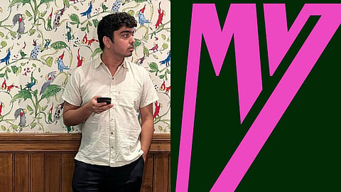
One such renowned professional typeface designer is Manav Dhiman, the founder of the independent, one-man design studio, Man vs. Type. He is a Delhi-based young creative with a bag full of experience in utilizing the power of typography to translate different brands' strategies and voices into riveting visual design. Manav’s typography is diverse and caters to a wide range of aesthetics. He has worked with big entertainment and tech companies such as Apple and Netflix. This Saturday (29th July 2023), he is going to conduct a series of three workshops, over a Zoom call, that will elevate your design game to the next level. The details are as follows:
In terms of learning the rudimentaries of design and typography, this workshop is absolutely ideal. You will get to learn the fundamentals of drawing type such as joining curves, using anchor points, bezier curves and all the other basic functions of Adobe Illustrator. There will be two walkthrough exercises after which you will draw along with Manav.
Register here.
This workshop is for unleashing the experimental type designer in you. Here you will learn to break free from the set rules of typography and embrace more unconventional styles. Having the Adobe Illustrator software is not a prerequisite for this workshop. You can also use a pen or paper, a Mac book, or any other such tools.
Register here.
Follow Man vs Type here.
